Compass Connect
Logo Design
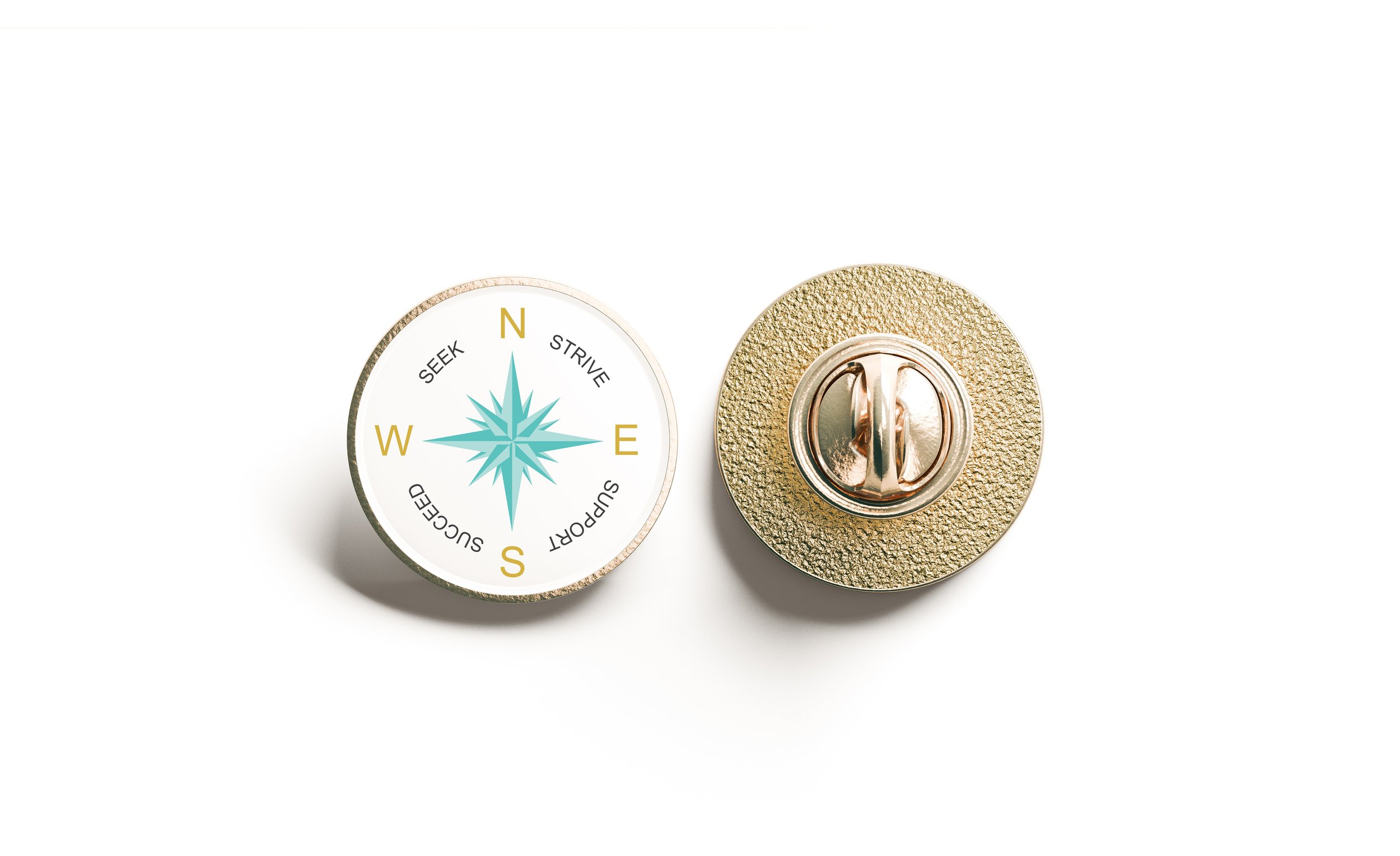
Study NSW commissioned this project on behalf of the Study Australia Partnership. The objective was to design a proposed symbol to represent Australia’s global education sector and the support provided to international students. The goal was to establish a unified visual mark that fosters connection and engagement across government, industry, and student communities.
The design is centred around a stylised North Star and a 16-wind compass rose, chosen to evoke navigation, diversity, and global connection. A circular tagline reinforces themes of unity and collaboration. Inclusive colours and a universally legible typeface ensure clarity and accessibility across diverse cultures.
Primarily developed for use as an enamel badge, the symbol was also intended for various digital and print applications, including social media, websites, email signatures, and compact promotional materials. The final design offers a flexible identity for the broader Study Australia initiative, striking a balance between accessibility, impact, and cohesion.