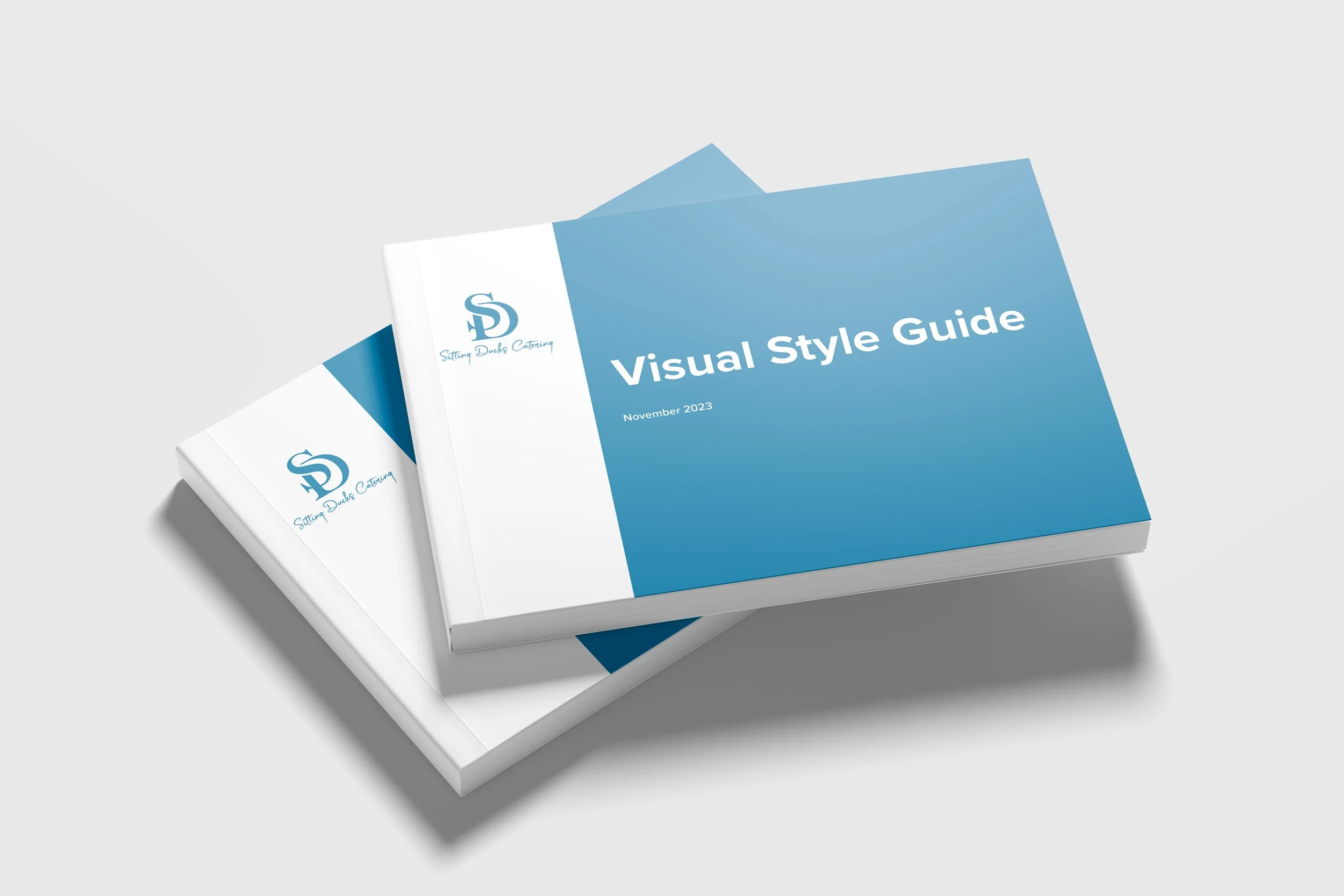
This conceptual rebrand revitalised the identity of Sitting Ducks Catering, an Australian-based company celebrated for its seasonal menus and personable service.
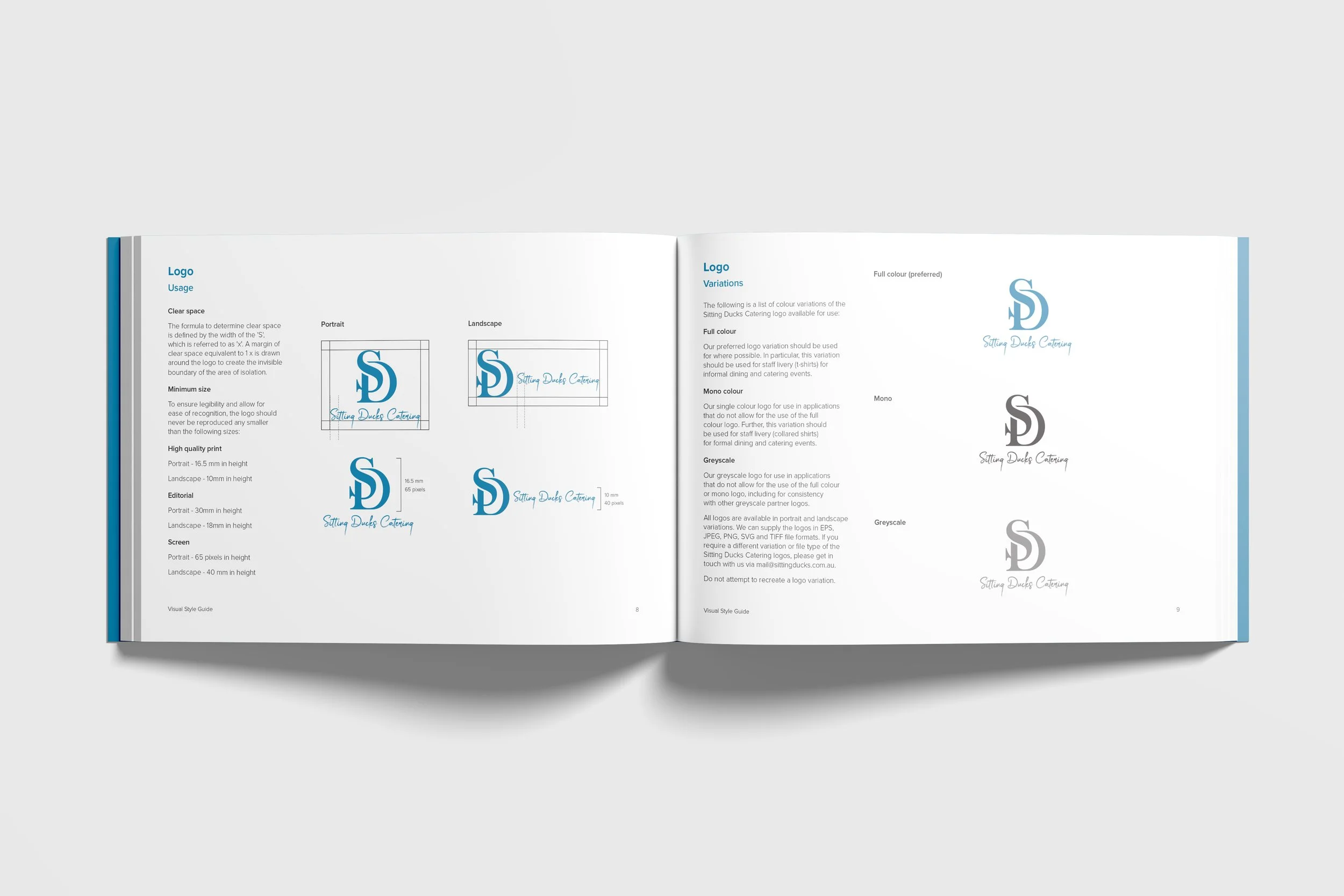
The updated logo embraces a clean, modern aesthetic that balances professionalism with a touch of playful charm. A refreshed colour palette of confident blue, black, and white ensures consistent application across both print and digital platforms.
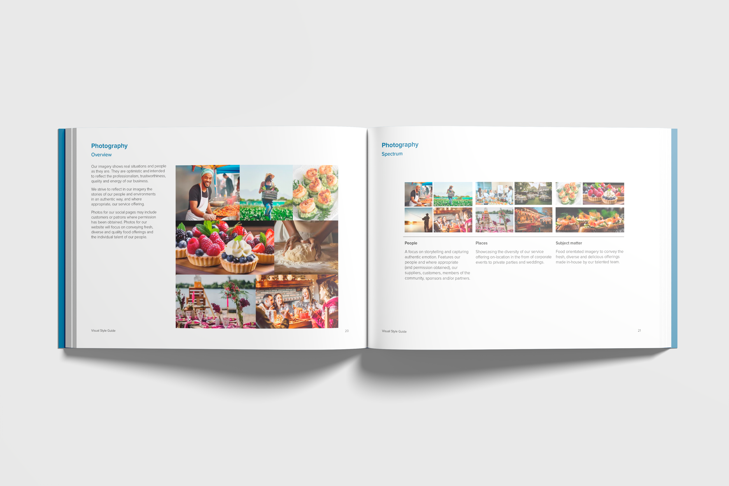
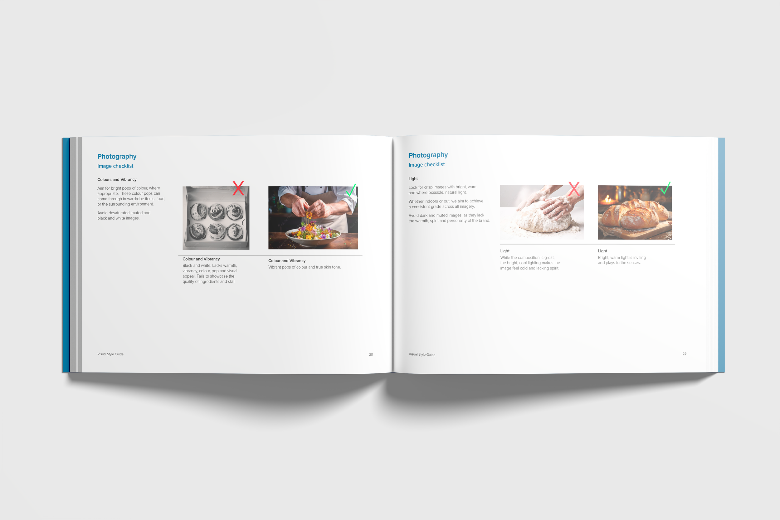
For the typography, a classic serif was paired with a contemporary script to signal stability, warmth, and personality. Minimal line illustrations and custom icons were developed to reinforce the brand's friendly, service-oriented ethos.
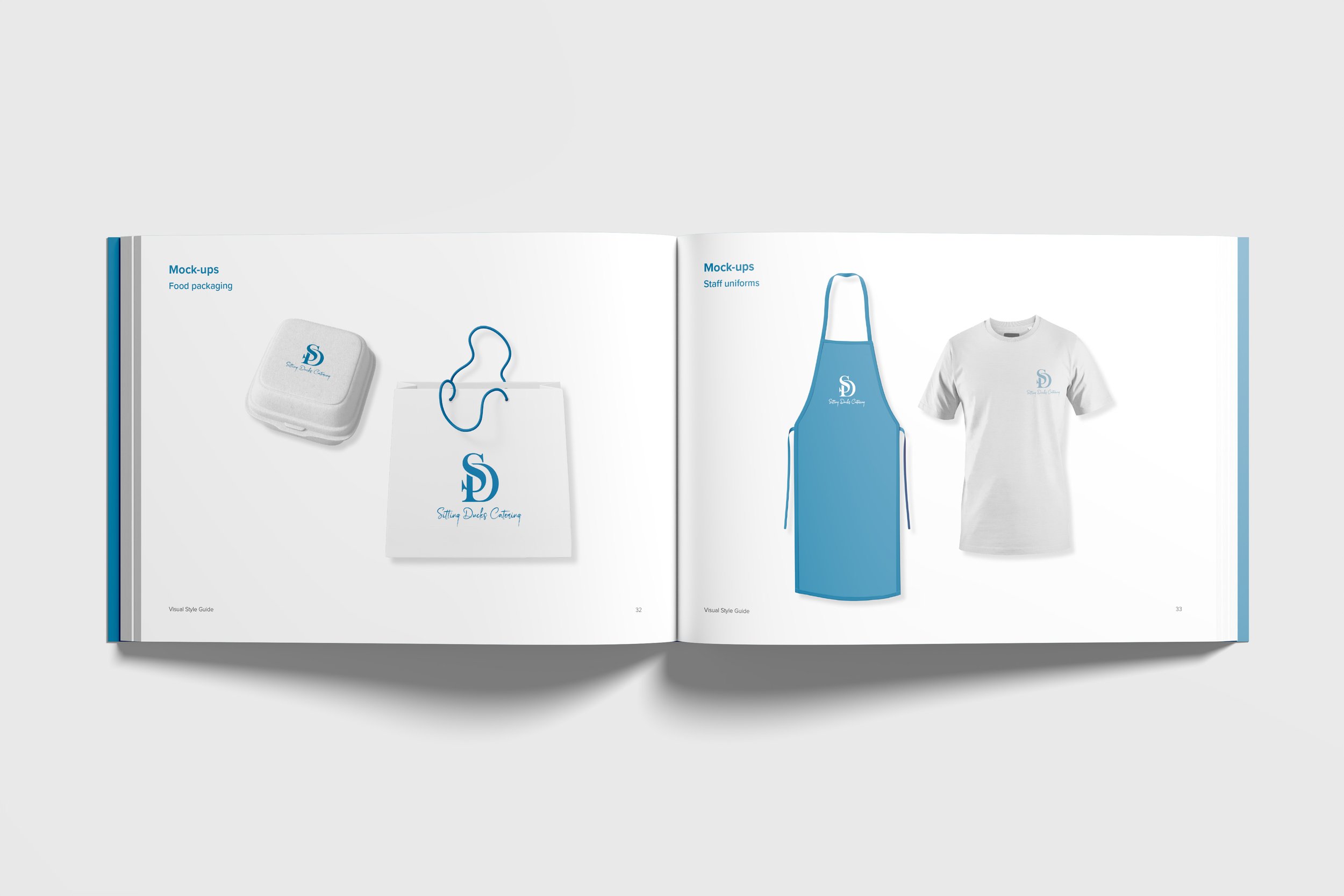
The project concluded with a comprehensive mini-style guide that outlined each asset and its intended use. Mock-ups for packaging, uniforms, and vehicle decals were created to reaffirm a polished yet personable brand identity, ready for confident application.
No Ordinary Duck
Branding & Identity Design