

Clara Rose Design
Brand Strategy & Visual Identity
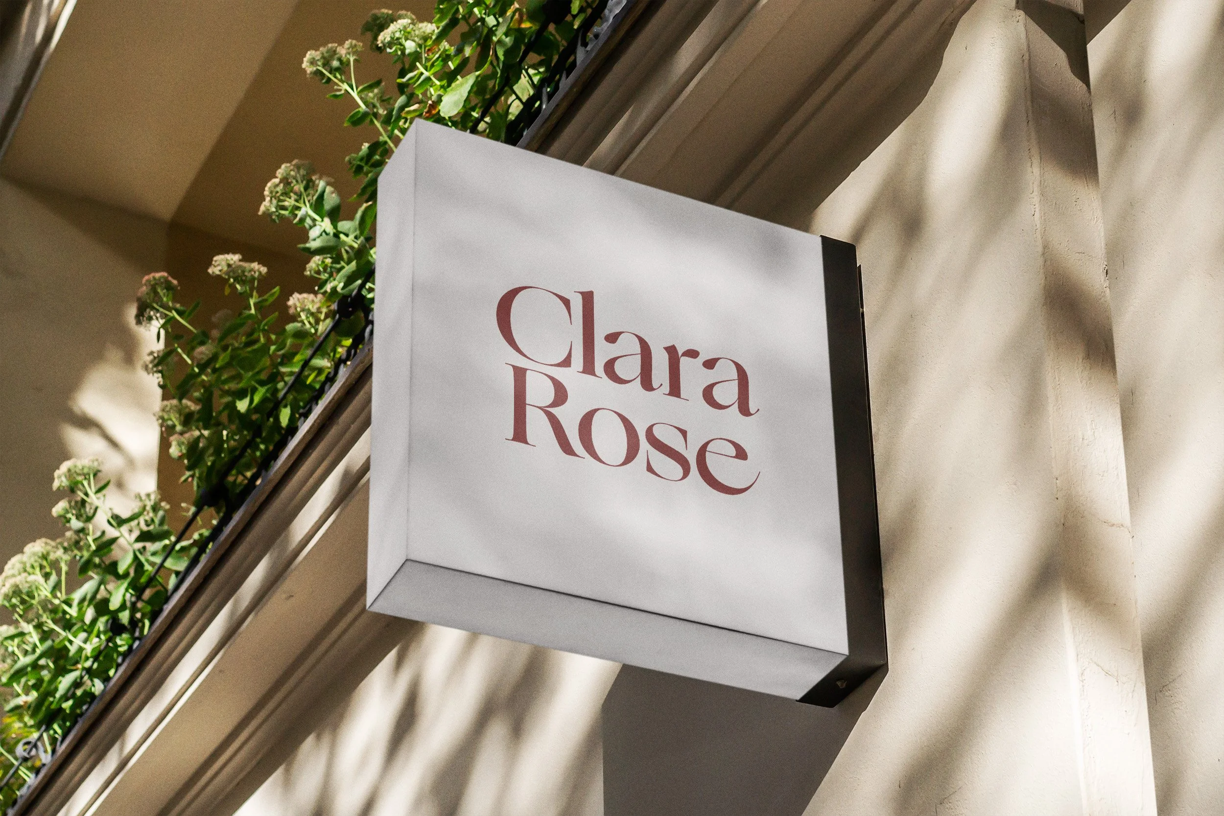
This strategic brand identity was created for Clara Rose Design, a heritage‑led interior studio shaped by an English sensibility and a love of curated, quietly elegant spaces.
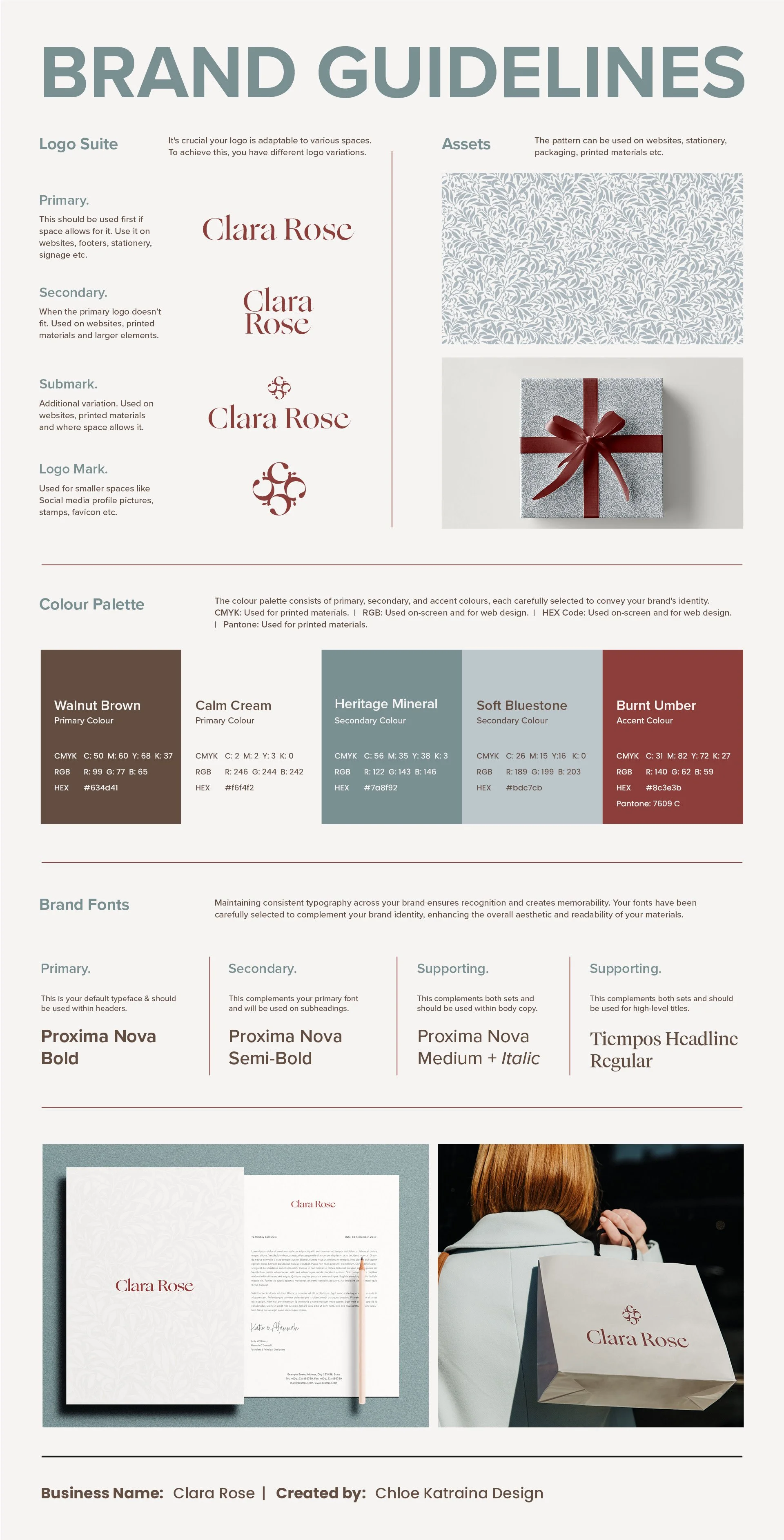
The brief required a visual language that felt timeless and reflective of the studio’s calm, considered approach, so I developed a refined logo system inspired by classic proportion and the layered quality of their interiors. The colour palette draws from walnut browns, mineral blues, and soft neutrals, with a Burnt Umber accent chosen for its warm, clay‑rich depth. The typography system pairs an elegant serif with a clean, editorial sans serif to balance heritage influence with modern clarity.
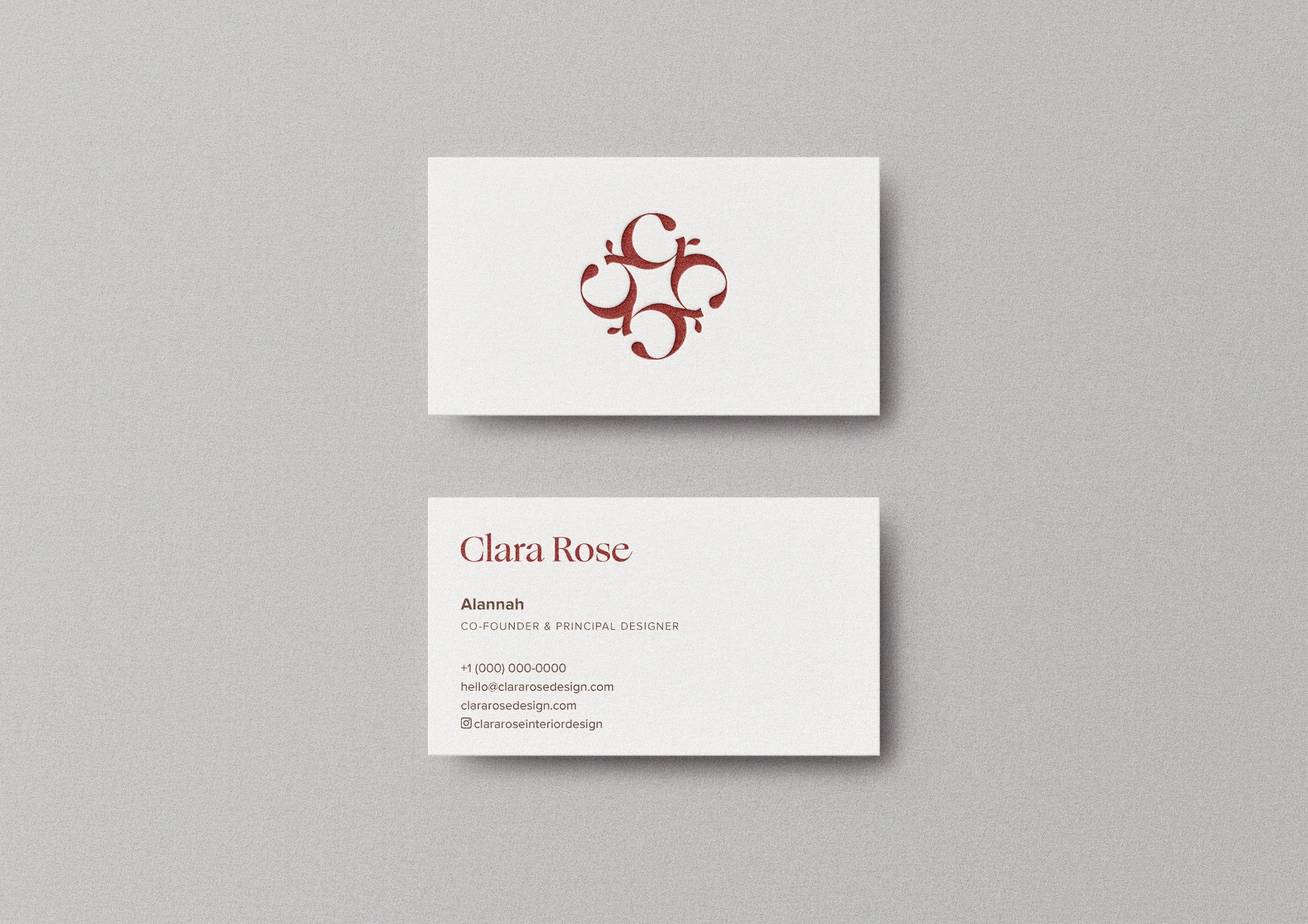
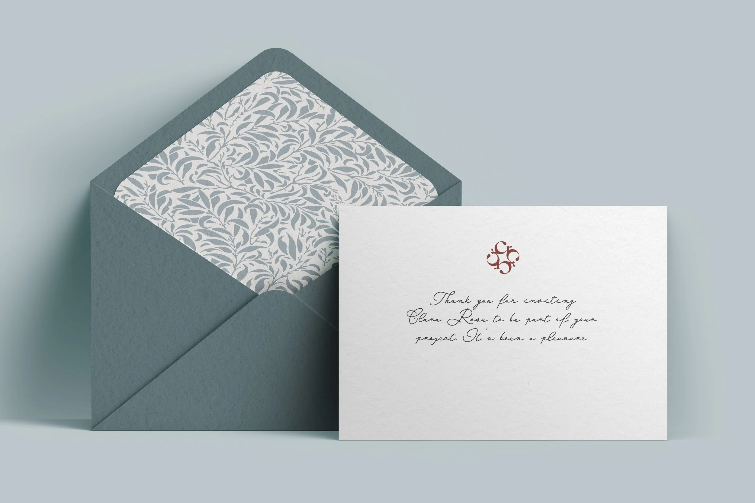
A custom pattern extends this language through subtle structure and repetition, echoing the studio’s thoughtful process. Printed on premium stock, the final business card brings all elements together in a quietly luxurious composition that captures the Clara Rose ethos — tactile, timeless, and quietly confident.
“Chloe understood our brand and our vision before we did. We came to her as a new business, without a clear idea of who we wanted to be, only who we didn't. She provided the blend of tradition and modernism that characterises our design sensibility with a bold, sophisticated colour palette and a unique logo that we never would have imagined, but have fallen in love with.”
- Katie & Alannah, Clara Rose Design